How to use media queries in CSS

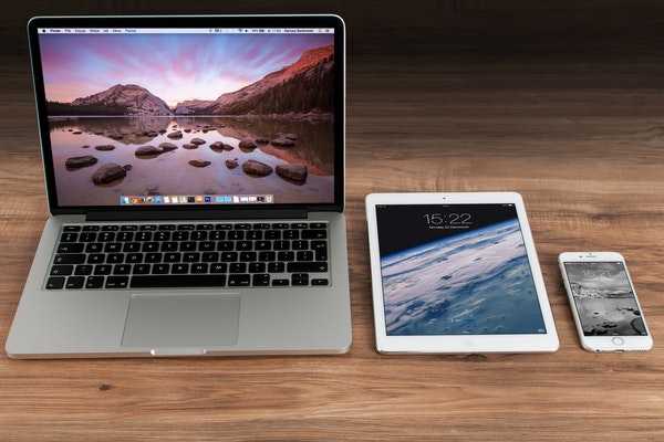
Media queries used to assign custom styling based on the browser screen size. For example, we can adjust the font color of text on desktop, tablet, and mobile screen sizes.
Using a media query, we can define the breakpoint for custom text styles for different screen size as below:
- Mobile screen size (0 - 480px)
- Tablet screen size (480px - 800px)
- Desktop screen size (800px - 1300px+)
So, our goal is to change the color of text on different screen size as below
- Mobile screen: blue color
- Tablet screen: green color
- Desktop screen: blue color
In the HTML, paste the code as below:
<div class="wrapper">
  <p>Lorem ipsum dolor sit amet, consectetur adipiscing elit. Maecenas auctor pulvinar auctor. Donec sagittis velit vel condimentum ullamcorper. In hac habitasse platea dictumst. Phasellus suscipit tempor dui, eget mollis eros blandit eget. Mauris mauris leo, fringilla sit amet ante ut, pharetra placerat nisi.</p>
</div>
The above HTML will display text on the browser screen.
By default, we define styles for <p> in CSS as below:
p{ color: blue; }The above paragraph style applies to the mobile screen.
To define the media query styling of desktop screen (800px+), we can write the media query as below:
@media screen and (min-width: 800px) {
  p{ color: red; }
}
Last, to define the media query for tablet screen (480px - 800px), we can write the media query as below:
@media screen and (min-width: 480px) and (max-width: 800px) {
  p{ color: green; }
}
Combine, we can write media query in CSS as below
p{ color: blue;
 }

@media screen and (min-width: 800px) {
  p{ color: red; }
}

@media screen and (min-width: 480px) and (max-width: 800px) {
  p{ color: green; }
}