3 CSS button styles with hover and active effects

The button is the call-to-action on the website. We can use CSS hover and active effects to add interaction to the button.
For example, when the user hovers and clicks the button, the state of the button changes. We can use CSS pseudo selector to style different CSS button states. The different states of the button are as follows.
- Button state without mouse interaction
- Button state when mouse hover
- Button state when the mouse is clicked
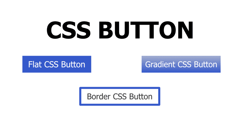
In this blog, we’ll create below CSS buttons.
- Flat CSS button
- Gradient CSS Button
- Border CSS button
The complete code can be viewed in the below Codepen link. https://codepen.io/taimoorsattar/pen/xxJRPzG
Flat CSS button is the button with the plain color. It’ll be interactive when the user hovers over it and clicks on it.
For the flat button, we can write the below code as below.
<div class="flat-button">Flat CSS Button</div>To style the flat button, we can write the below code in CSS.
.flat-button {
  font-weight: bold;
  display: inline-block;
  padding: 10px 15px;
  cursor: pointer;
  background-color: #3458cb;
  color: white;
}

.flat-button:hover {
  background-color: #2a47a2;
}
.flat-button:active {
  color: #d6def5;
}
Gradient CSS button has different shades of color that transition from one end to another. When the user clicks and hover on the button, the transition of the gradient changes.
For the Gradient button, we can write the below line of code in the HTML.
<div class="gradient-button">Gradient CSS Button</div>To style the gradient button, we can write the below line of code in CSS.
.gradient-button {
  font-weight: bold;
  display: inline-block;
  padding: 10px 15px;
  cursor: pointer;
  background-image: linear-gradient(to bottom, #a2adcd, #3559cb);
  color: white;
}

.gradient-button:hover {
  background-image: linear-gradient(to bottom, #3559cb, #a2adcd);
}
.gradient-button:active {
  color: #d6def5;
}
Border CSS button is also used in many websites. When the user hovers over the button, the color of the border become the background color of the button.
For the border button, we can write the below line of code in HTML.
<div class="border-button">Border CSS Button</div>In CSS, we can write the code as below.
.border-button {
  font-weight: bold;
  display: inline-block;
  padding: 10px 15px;
  cursor: pointer;
  border: 4px solid #3458cb;
  color: black;
}

.border-button:hover {
  transition: 0.3s all;
  border: none;
  border: 4px solid white;
  background-color: #3458cb;
  color: white;
}
.border-button:active {
  color: #d6def5;
}